Take a sneak peek into the process behind turning an old, degen-themed Harvest into a full-scale Web3 platform accommodating a wide range of DeFi users with vastly improved deposit modules, increased transparency, clearer product offering, and much more.
Background
Harvest was one of the pioneering DeFi platforms that helped users auto-compound liquidity mining rewards while saving on network fees. Launched in 2020 in the middle of the so-called DeFi Summer, it quickly stood out with its degen product theme made for experienced users.
The Problem
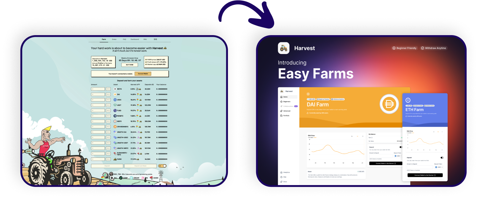
Harvest was a one-page, not-mobile-friendly DeFi app. To get started, users had to source tokens from external sources (often obscure, uncertain apps), which made Harvest lose a ton of incoming traffic. The products, so-called ‘farms,’ provided little to no information about what was happening with users’ funds or what was the source of yield.
Solution
To address these issues, I prototyped and designed a new platform from scratch. The main objectives were to make it mobile friendly, more intuitive, provide better information about the product and scale down the degen theme to welcome less-degen user type.
The Works
After sketching a bunch of prototypes and layouts, I settled on a clean and semi-minimal approach for Harvest. Given the amount of information Harvest users had to be presented with, I trimmed all sorts of distractions to minimum.
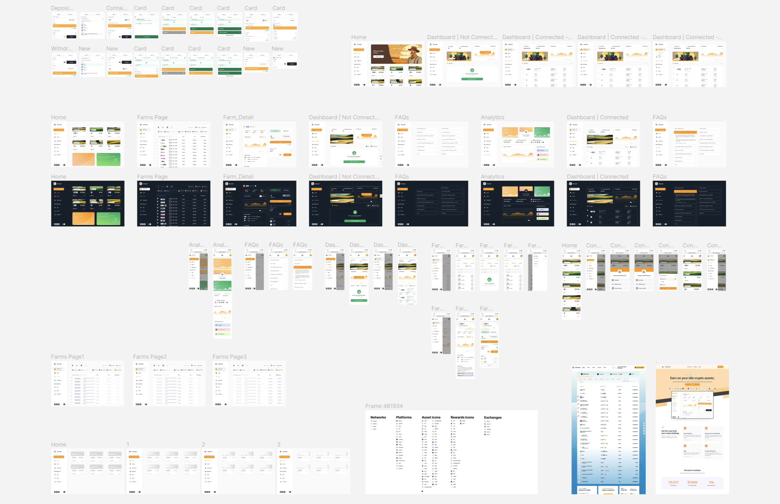
I collected a bunch of modules into one Figma page to showcase the scope of works needed for a full app revamp.
Here’s a bird’s view of core components and pages of the Harvest app. There are mobile and desktop mockups, all core pages such as Home, Farm’s List, Portfolio, Analytics and FAQ. Each of them ultimately ended up having a dark mode which plenty of Harvest users requred. There are also other elements such as skeleton screens or in the top left corner, you can spot the deposit and withdraw modules, which I’ll go into more detail in a moment.
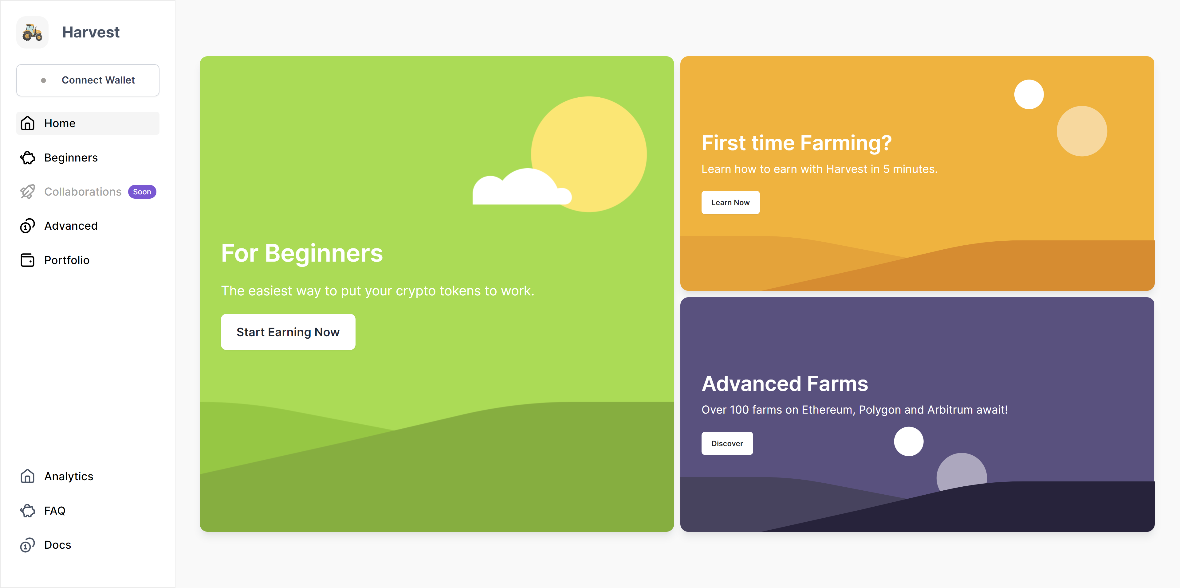
The new 'Home'
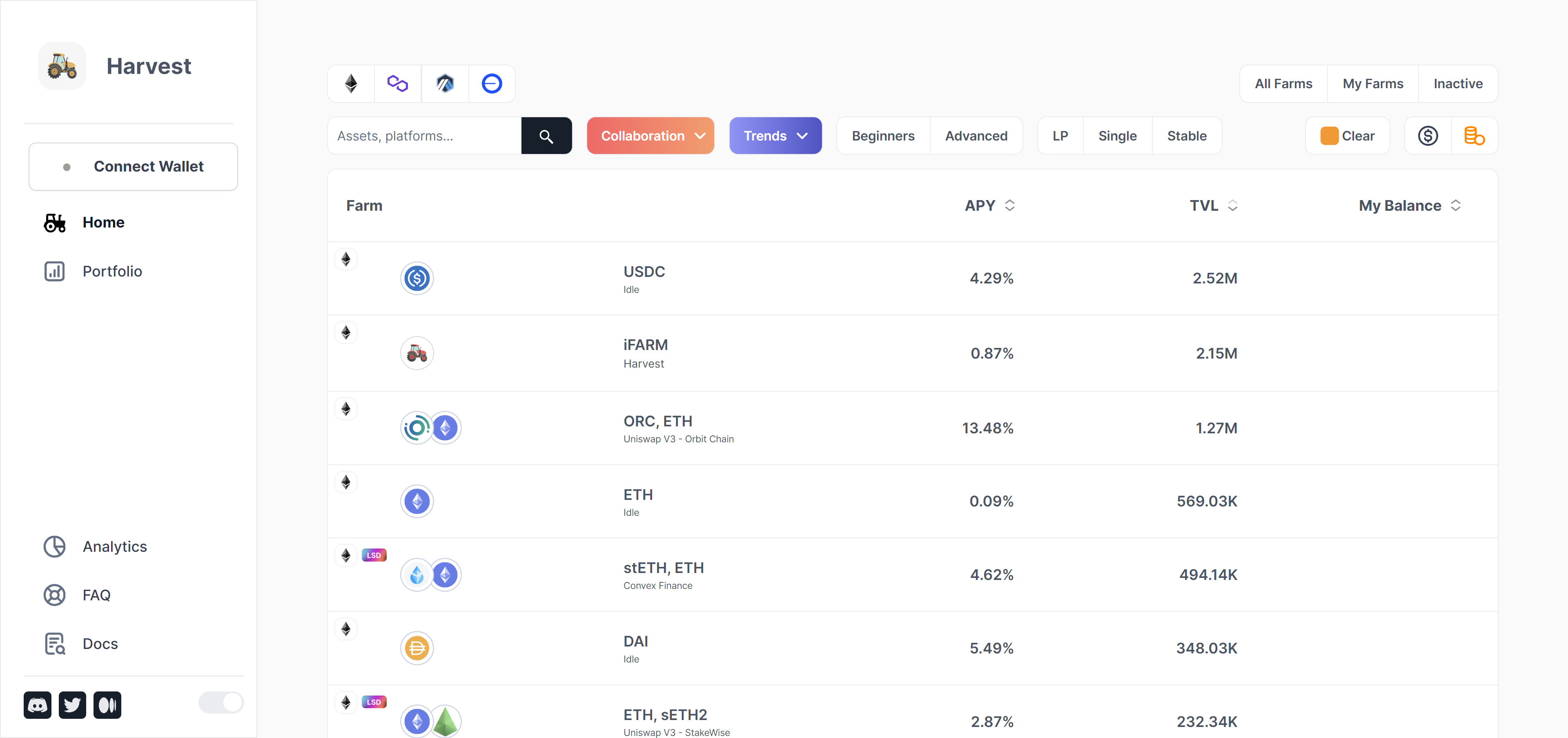
The new app welcomes users with a clear, full list of farms – its token composition, underlying platform, network and the top indicators such as APY, TVL, and My Balance for connected users.
The top section offers a wide selection of filters and networks alongside a dynamic search bar to help users find their favorite assets to farm.
The menu’s top section immediately asks users to connect the wallet, and the gray dot (which can be interpreted as being offline) urges them to do it promptly.
Very happy to introduce dedicated pages for Harvest's products, allowing for easier social discovery as each farm now finally had its own URL!
The results I’m most proud of are visible on farms’ individual pages. Let me remind you that before that, all farms and their inputs were hosted on a single page.
Here, I structured the page to contain the following:
The first row ensures the user that they clicked on the correct farm from the main farm list
The first box in the second row displays top farm indicators, equipped with tooltips and explainers for less savvy users
Next up, a detailed and interactive chart visualising the evolution of top indicators with four timeframes to choose from
Below, a user is presented with the APY composition which helps understand the source of yield
Underneath, is an automated farm description that informs the user what happens with their deposit, followed by two buttons to smart contracts for advanced users who can verify these claims by looking at on-chain data
On the right side, the user is provided with a deposit/withdraw module which guides them step by step to complete the intended action -> increasing the deposit rate thanks to a much more clear and convenient fashion (unlike before, when a user had to leave the app in order to acquire the right tokens to make the deposit)
Below a box informing users about deposit and withdrawal fees, which in Harvest’s case at the time were 0 for all farms (while other platforms were charging fees!) – that’s why I decided to put it right underneath the deposit module to increase a chance of a user making a deposit
Lastly, there is an important Rewards box that extrapolates user’s extra rewards originating from Harvest’s emissions or 3rd party incentives, with a clear button to claim them anytime
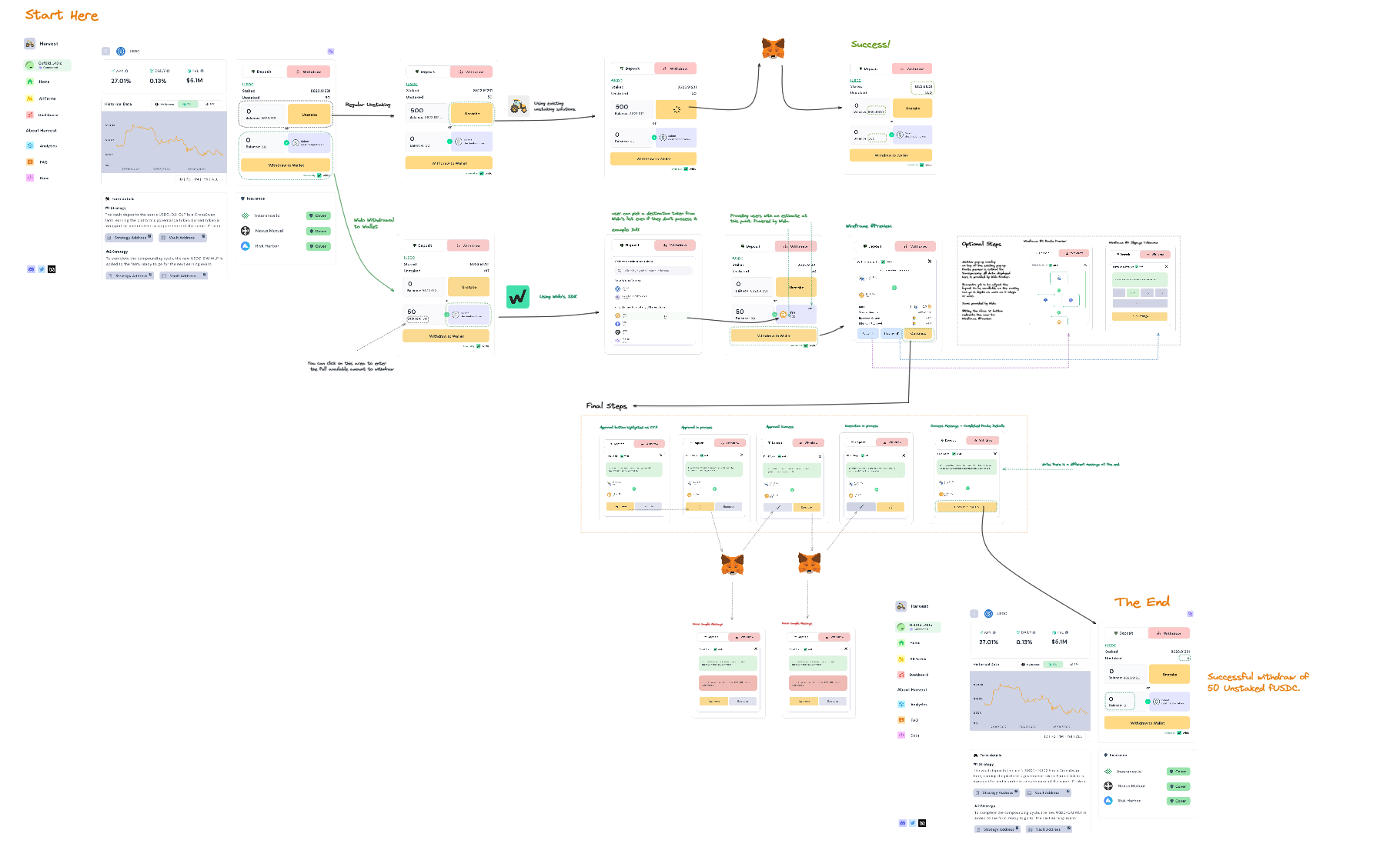
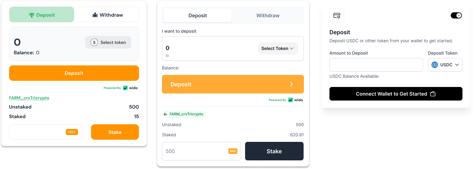
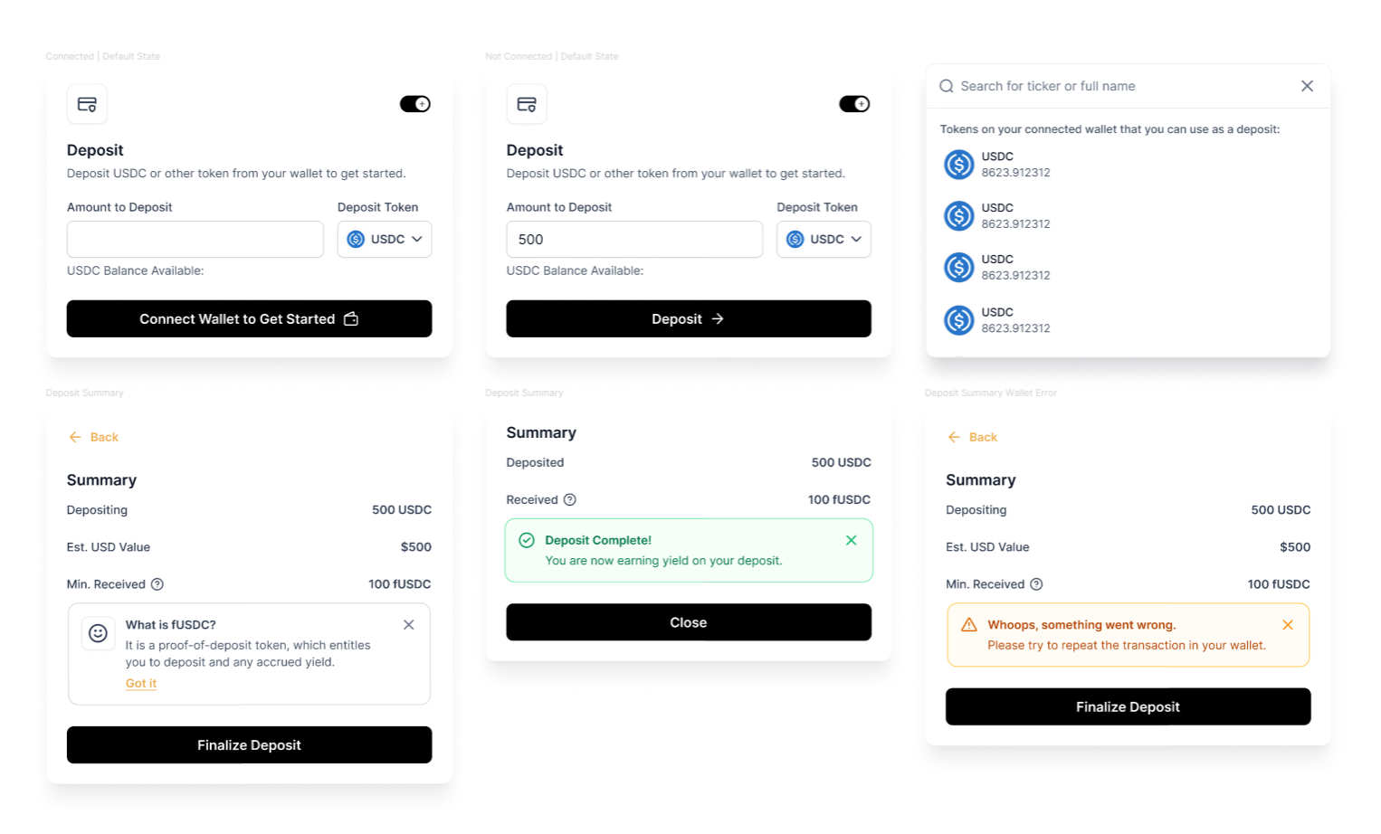
The Deposit/Withdraw Module
When working on the new app for Harvest, I stumbled upon Wido – a zap & routing provider that helps users of projects such as Harvest with any token deposits. What it meant that with Wido, Harvest was able to let user use the ‘ETH’ farm with their USDC or more exotic tokens such as CRV. Under the hood, Wido was handling all th necessary swaps for the user.
I knew that if Harvest integrates with Wido, it can significantly increase the deposit rate as users not only don’t have to leave the app anymore but also can just pick any token from their wallet and hit deposit.
Easier said than done. At the time, no one had done this before at this scale, and I spent countless hours with the Wido founder discussing the design of the deposit/withdraw module for Harvest. Above is the first iteration of complete routes and modules for each scenario (including errors and settings).
Below you can see how the deposit module evolved – trimming and scaling down on unnecessary labels, and repetitions to simplify the UX.
Bringing Figmas to Life
Prototyping and designing is one thing. The next part was more difficult – explaining the functionality of each component and instructing the full-stack developer on proper implementation. It wasn’t an easy task as I had to work with a freshly onboarded developer to Harvest who had little experience with DeFi products. So, for him to build the app I had to teach him everything about Harvest first and explain in-depth each component I have planned, then carefully oversee his work.
The Work Doesn’t End Up Here
After coding all these mockups into existence with the dev team at Harvest, a new challenge arised.
While the revamped platform indeed offered a better UX, more transparent and was finally mobile friendly, it still had a problem.
The problem was that the overwhelming amount of farms and information on their dedicated pages was still overwhelming for users. And it wasn’t anyone’s guess. After the new design being live, Harvest launched a Zealy campaign during which it reported a sizeable feedback coming from new users and their issues with getting started.
They had no idea what was the best farm to get started as a beginner, how to make a deposit or how earnings were calculated.
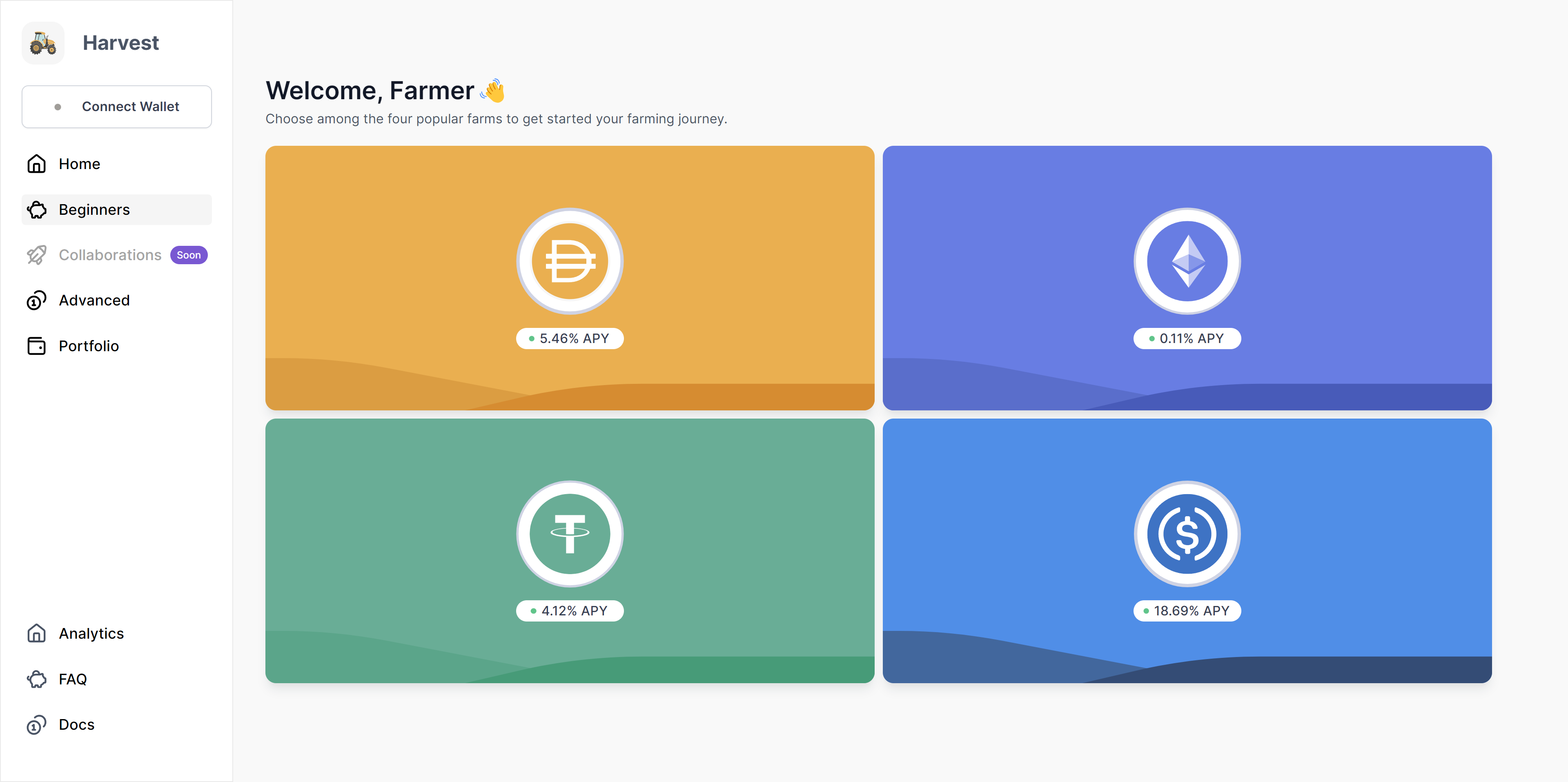
I took that personally and went back to the whiteboard and after a few days I was happy with the results of the new Home section offering limited path for users to choose from. From now on its purpose was to weed out the newcomers and point them to ‘For Beginners’ section.
don't mind the same icons in bottom left corner please!
Here, users were presented with the most recognizeable crypto tokens, ensuring them that they indeed landed on a page for beginners.
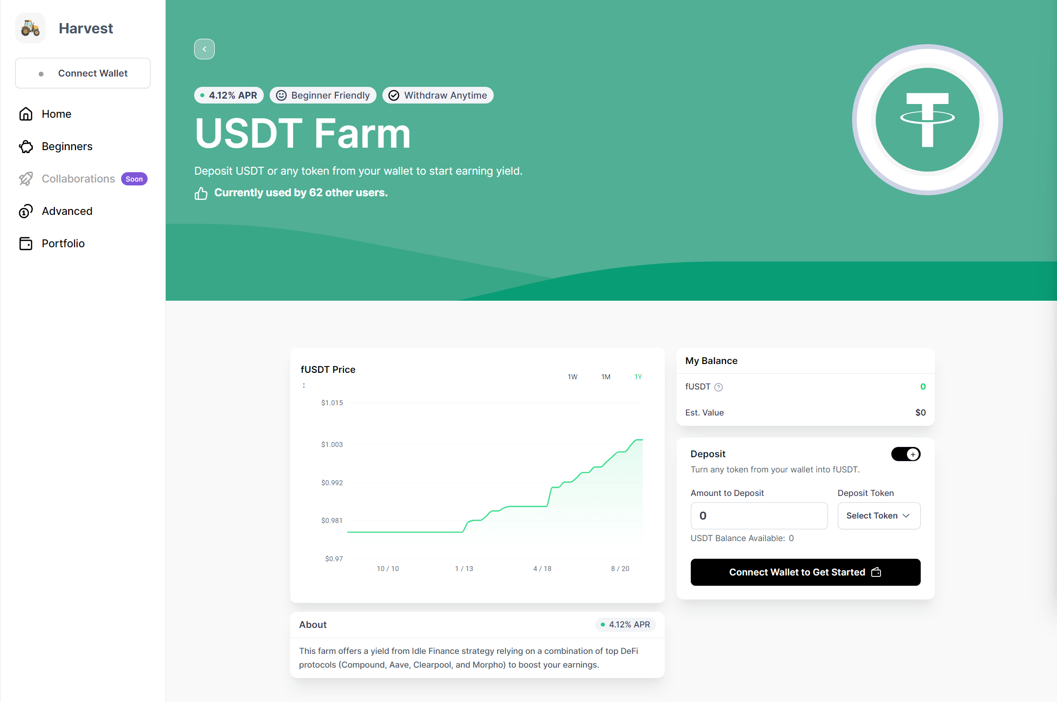
Limiting the choice to only 4 tokens compared to a previous list of 100 farms, users were more eager to click on any of them to see what’s inside. Let’s take a look at the USDT farm:
The single page for Beginners:
has been trimmed down to display only the absolutely necessary data
has much more pleasant and calm visuals
contains just one chart displaying fToken’s (Harvest’s interest-bearing token) sharePrice evolution which is a much more accurate and convincing data point for users
has a simpllified deposit module containing less steps than the ones in the Advanced section